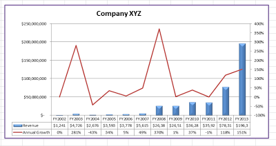
Hi there, in this post I will show you how to make the Excel chart above, one with two axes (primary and secondary axes) and two different chart types.
So let's start!
Make a fictitious table of a company's 12 year annual revenue figure, like the one below.
Then as shown below, select the entire table and insert a Column chart. After selecting the table, just click on Insert on the Menu bar, then Column and the 2-D cluster column chart (1st chart)
A chart like the one below will come up
Now, we are going to change the Annual Growth to a line chart. Right click on the Annual Growth legend in the chart and select Change Series Chart Type
Then, choose the Line chart
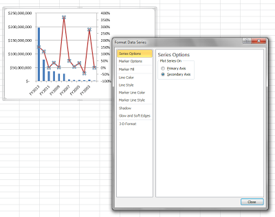
To do this, right click once again on the Annual Growth legend and select Format Data Series
Then in the Series Options, select Secondary Axis
We are nearly done.
We will give our chart a Title. To do this, goto Layout on the Menu bar, click on Chart Title, select Above Chart (recommended). I titled it Company XYZ.
To do this, (again) goto Layout on the Menu bar, click on Legend, then None.
Wow! We're almost there.
Now, we'll add a Data table to make the chart more readable and professional.
Still under the Layout, click on Data Table, and select Show Data Table with Legend Keys
Looking pro!
Let me show some extra formatting tools often used.
Goto Format and try out the different chart formats. Below are some screenshots.
But I prefer this -
You can make the data bars for Revenue look more visually appealing. Just goto Format, Shape Effects, and try out the different effects possible. Settle for the one you most prefer. In this sample chart (below) I applied the second Preset (named Preset 2).
Now the chart is done.
BONUS: If you prefer to see the years progress from left to right (and not the right to left we did), very easy. Just right click on the Year (in cell A1), and sort, A-Z.
Voila! Here is the resulting chart.
Congratulations, you are now an advanced Excel user. Only a small percentage of Excel users can create this chart you just made.
Need extra help, contact me via the comment box.


0 comments:
Post a Comment
You can be sure of a response, a very relevant one too!
Click on Subscribe by Email just down below the comment box so you'll be notified of my response.
Thanks!